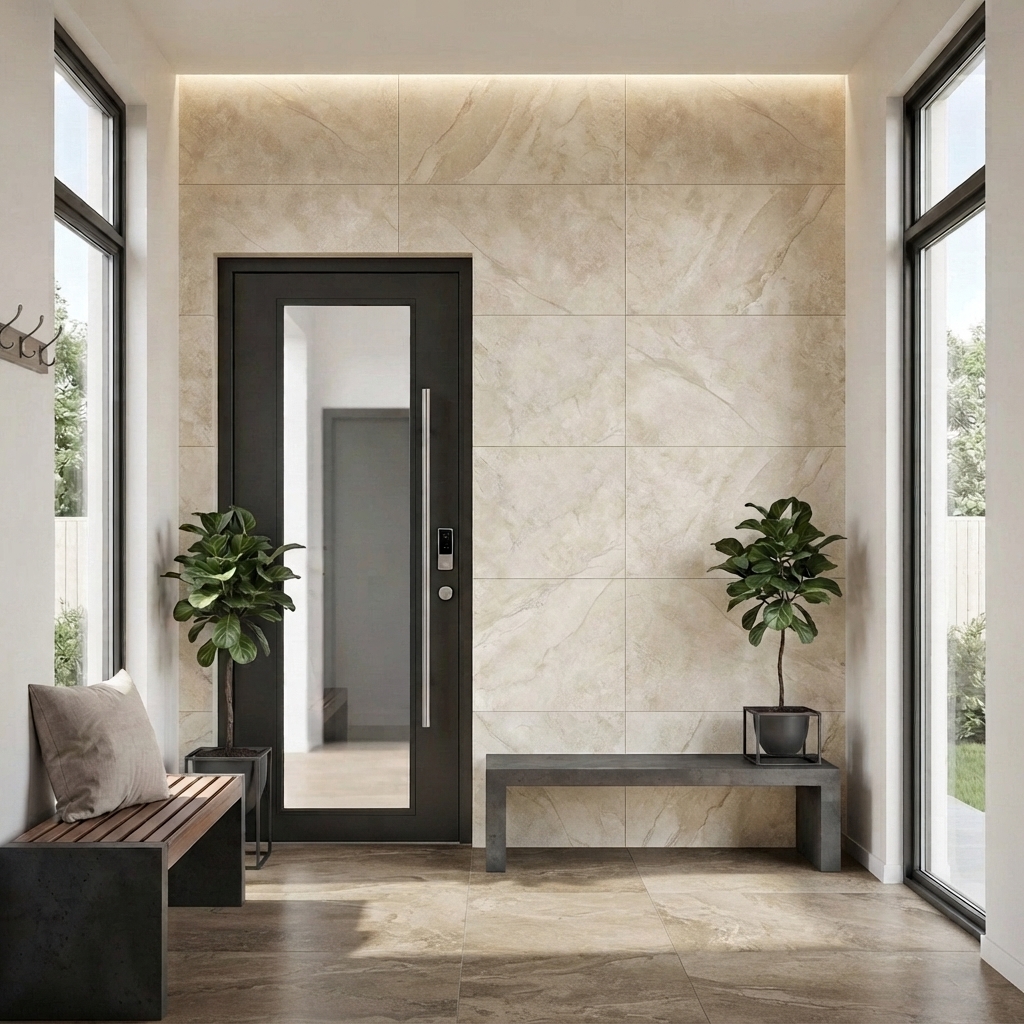
Nobody regrets the green kitchen: the case for one bold surface
Almost everyone leaves with grey because grey is defensible. Here is the case for one brave surface, kept calm on every side.
By OnWood Tiles
Almost everyone who walks in says they want to do something a bit different, and almost everyone leaves with grey. Not because they changed their mind, but because grey is the choice you can defend to your mother, your builder, and a buyer you have not met yet. The fear is always resale.
So, plainly: tile is rarely what dates a room. Tapware dates a room. Handles, light fittings and one particular shade of white date a room. A considered jade splashback will still look considered long after the rangehood beside it looks like 2026. This is the case for putting one brave surface in your house and keeping everything around it quiet.

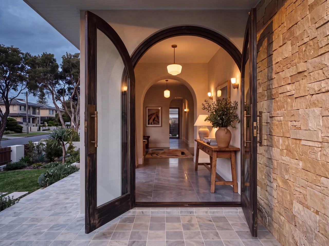
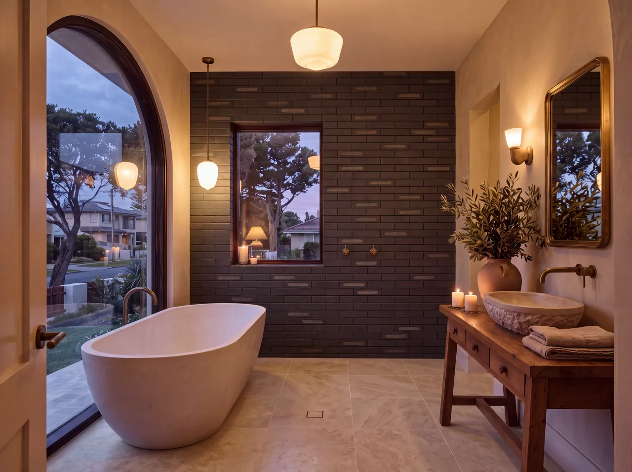
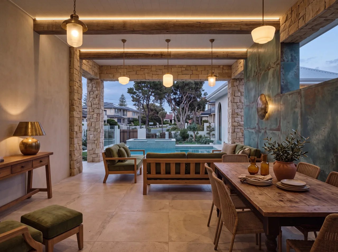
The room people photograph is never the beige one.
Bold does not mean loud
In each of these rooms the brave decision is held to a single surface, and everything around it is deliberately calm. Travertine, timber, brass, plaster. The colour is given somewhere to sit, and that is the whole trick. A jade splashback works because the joinery, the bench and the walls beside it are quiet and hard-wearing. Give one surface a colour you actually love, then let the rest of the room stay restrained behind it. Bold and loud are not the same thing, and the difference is almost always about how much else you ask the eye to look at.
If you are nervous, start on a wall
A wall takes less material, costs less to lay, and is far easier to change your mind about in eight years than a floor running through the house. So put the risk where it is cheap and keep the calm where it is expensive. A feature wall or a splashback lets you live with a real colour on a real surface without committing the whole ground plane to it. If it turns out you love it, you already know the answer for next time. If you tire of it, a wall is a far kinder thing to redo than a floor.
Finish moves a colour further than shade does
The same jade in gloss and matt are not the same tile. Gloss throws light around and makes a small room feel larger and wetter. Matt absorbs it and makes the colour read like plaster or clay. So if a colour feels too strong, the honest fix is usually the matt version rather than a paler shade.
One more thing, and it matters here more than most places. Queensland light is harder and brighter than the European moodboards these ideas come from. A green that reads deep and calm on a moodboard can go acid in a north-facing kitchen at two in the afternoon. That is not a reason to avoid colour, it is a reason to borrow the sample and look at it in the actual room at seven in the morning and again at five. Pick the surface you look at most, give it a colour you love, and let the rest be quiet.
This feature is in Kiln, our magazine. Flick through it here.
Ready to be a little braver? Browse our tiles or book a showroom visit.
Written by OnWood Tiles, 16 August 2026