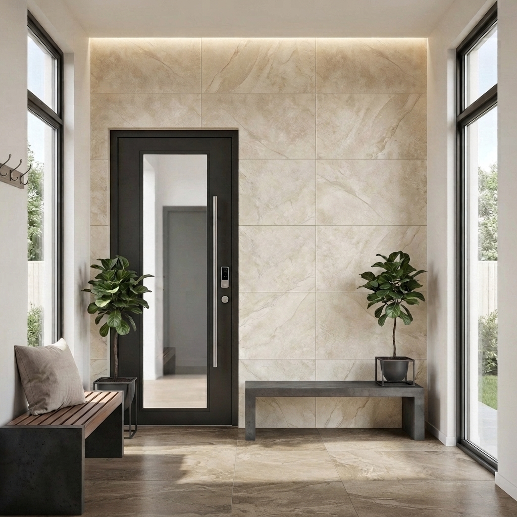
Why timber-look tile stopped looking fake (and how to spot the good stuff)
Wrote off timber-look tile back in 2004? Your memory is fair but out of date. Here is what changed, and the ten-second test that spots the good stuff.
By OnWood Tiles
If you looked at timber-look tile in 2004 and have not looked since, your opinion is correct and out of date. Back then you could stand at the door and see the repeat. The same knot, the same grain, recurring in a rhythm your eye caught whether you wanted it to or not. It was not your imagination and it was not bad taste. It was the printing, and the printing has changed completely since then.
Here is how to tell the honest planks from the fakes, and why the category is worth a second look from anyone who wrote it off.
Why the old tiles gave themselves away
The early machines pressed images onto tile with screens. Each screen holds one picture, and every extra picture is another screen to change on the line, so a typical run had just four faces. Four faces across forty square metres is a repeat every few tiles. Lay a floor of it and your eye finds the pattern, because your eye is very good at finding patterns.
Then, around 2007, printheads arrived that continuously recirculate the ink, and that single change rewrote the whole category.
What actually changed under the hood
Ceramic ink is not dye. It is ground mineral pigment, because it has to survive the kiln and come out still looking like wood. That is also why it caused trouble. Left sitting, the pigment settles and dries in the nozzle like sand in still water. Keep it moving and it cannot settle.
WHY IT CLOGGED is easy to picture. You are firing finely ground stone through a nozzle a fraction of the width of a hair. Stand that still for a moment and it blocks. The recirculating printhead never lets the ink stop, so digital printing finally worked for tile.
Once it worked, faces were free. A maker could print forty different planks instead of four, or scan a real board and print every one of them. That is the whole story.
The tile did not get more expensive. It got more honest.
That is the shift worth understanding before you shop. Whether a floor reads as real or reads as printed is no longer about price. It is about how many faces the range carries, and whether the texture underneath matches the picture on top.
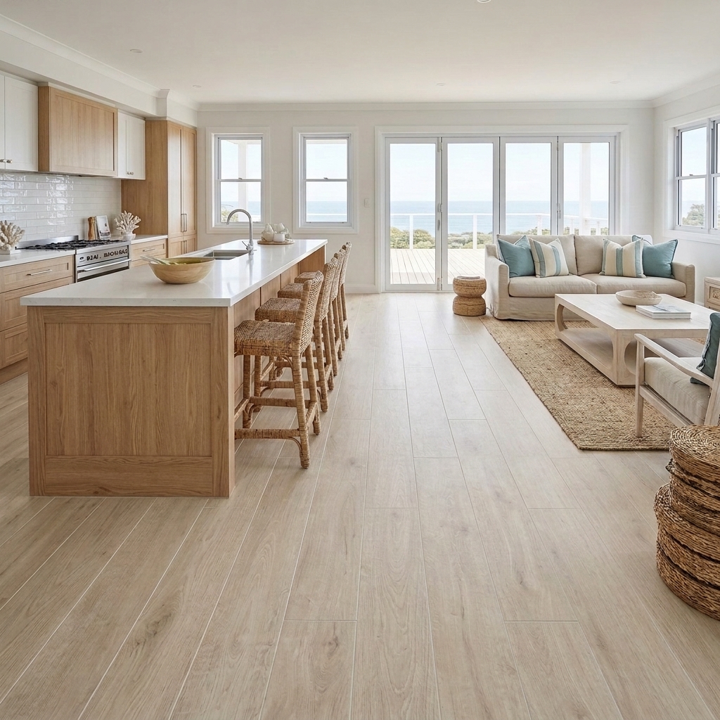
The ten-second test in the showroom
You do not need a spec sheet to sort good from lesser. You need ten seconds and your own hands. Do these two things at the display.
- Count the planks. Pull ten tiles off the display and lay them side by side. Two or three the same means a four-to-six face product that will repeat in any real room. All ten different means a proper digital face count, and a floor that will not give itself away.
- Feel the grain. Run your fingers across the surface with your eyes shut. On good product you press a knot and feel a knot, because the texture follows the image. On lesser product the texture is a generic emboss with no relationship to the picture printed on top, and your fingers will tell you before your eyes do.
That is it. Count, then feel. If the ten planks all differ and the grain lines up with what you are seeing, you are looking at the honest kind.
The one question worth asking
Everything above comes down to a single number, and it is a number the box almost never prints.
So ask it. "How many faces?" tells you in one answer what your eye would eventually work out on the floor. A range built from a real scanned board will happily give you a high number.
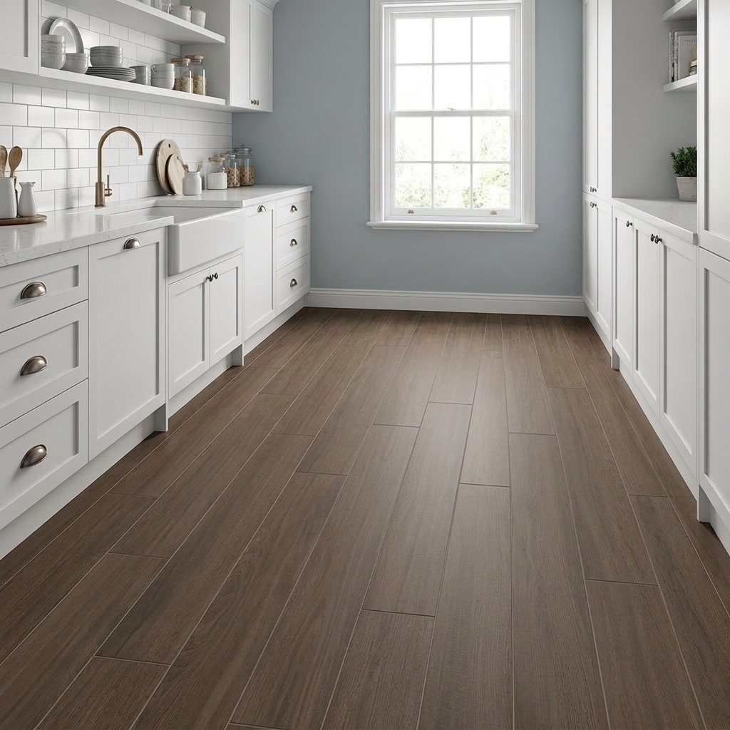
That is why the category earns a fresh look. The tiles that used to give themselves away have been quietly outgrown. The good ones now carry enough faces that the repeat disappears at room scale, and enough real texture that your fingers agree with your eyes.
This piece appears in Kiln, our magazine. Flick through it here.
When you are ready, browse our timber-look tiles or book a showroom visit and run the ten-second test yourself.
Written by OnWood Tiles, 16 August 2026